Sunday 24 January 2010

Assignment 1 - Response to Tutor Feedback

Straight
I went back to Clissold Park this morning to have another go at the image representing 'straight'. This time I decided to shoot in infrared since the image was going to be monochrome, and I thought that the grass might be more interesting than before. I have positioned the tree to the left, as advised by my tutor.

I think the revised image is much cleaner and less contrasty than my first attempt perhaps because the second image was taken early in the morning while the sun was still fairly low. I applied some tonal contrasting to the trunk of the tree to bring out more detail in the bark and cloned out the lower sections of 2 trees in the background, along with some debris on the path. This shot has also been uploaded to my website which is now ready to launch!

Curved

Russell referred to "no real border or focal point to frame the subject", so I returned to Hays Galleria to take the shot again. This time, I faced the opposite direction because the sky was not visible from my original viewpoint. I took 3 bracketed shots because of the tonal range between the roof and clouds. I think this shot is now less abstract and the use of leading lines and framing provide a clear focal point.

Saturday 23 January 2010

Kew Gardens

I went to Kew to get some shots that I'd failed to get in the Summer due to lens flare and hotspots. I also have a couple of gaps on my website that need filling.
I took three bracketed exposures of the stone arch and the Japanese building, and produced HDR images in Photomatix Pro. I opted for a sqaure crop for the stone arch to draw attention to the archway.


There is one more image that I need, and then I can get back to my OCA exercises - I feel as though I've been neglecting my studies although I have been taking pictures. I'm going to try and get the 'final shot' tomorrow!

Friday 22 January 2010

Candid Creativity Website

I created this Animoto video today to promote the launch of my website on 14 February. I'm going to upload it to You Tube and my Facebook Fan Page in a couple of weeks, and then see what happens!


Sunday 17 January 2010

SWPP Photographic Convention

I went along to this at the Novotel in Hammersmith. The majority of exhibitors were selling frames and print services, but I saw some really good demonstrations of Nik's Viveza, On One's Mask Pro and Animoto.
I bought Viveza and Define (academic versions), which were massively reduced, and took out a subscription to Animoto, who gave me 15 months for the price of 12.
The Animoto software is just what I was looking for to create promotional videos for when my website goes live. It will save me alot of time and technical expertise!

Saturday 9 January 2010

Too much snow!

I haven't been able to get out and take pictures because of the persistent snow we've had. The pavements and side roads are like sheet ice and the sky is incredibly dull. However, I decided to try and get some shots 'indoors' today. I went to Canary Wharf Station to try and re-create a shot in infrared that I'd shot in colour in 2008, but I got the exposure all wrong, so I'll have to go back and reshoot it.
I got the DLR to Greenwich and took IR pictures of the chapel using my fish-eye lens. This is another image that I'd previously captured in colour during 2008, but the windows were blown out. On this occasion, I bracketed 3 shots and produced a HDR image in Photomatix Pro, with a little fine-tuning in Photoshop. This is what I ended up with:


On the way home, I stopped off in Blackheath to take this shot:


I added a filter called 'Midnight' from Nik's Color Efex, to try and make the clouds look even more dramatic than they actually were.

Tuesday 5 January 2010

Assignment 1 - Tutor Feedback

Your approach to this assignment is excellent, demonstrating an enquiring mind and eye, and a positive and creative approach to technical exploration. As you say in your notes, this kind of assignment makes us look for images that we might not ordinarily look for, in addition to dealing with conceptual approaches to interpreting the subject/s.

Straight and Curved
The shot of the tree in Clissold Park for ‘Straight’ works very well, a visual pun, turning the world on its side. The monochrome filter enhances the composition, defining the form and texture of the subject, and also the diagonals in the mid-ground created by the white borders and strips of sunlight. I wonder if the composition might be stronger with the tree positioned to the left of the frame, with the broad diagonal strip of path running away down the right?

‘Curved’ is a strong image, and a tricky one to get right with no real border or focal point to frame the subject. Maybe just a detail (as in the shot of the Thames Barrier) would be a possibility, although this would not help realise the scale of the structure. The other option would be a fish-eye, which would capture more of the lower part of the building and provide extra context. Whichever, here you’ve captured the structure and silhouetted framework of the roof nicely.

Smooth and Rough
Getting the range of exposure right on highly reflective structures and surfaces is a real challenge, and I always like to try to get it right in the camera. As you say in you notes, the low, soft winter light can be a real bonus. The other option of course is to use multiple exposures (from a fixed image position) to combine to achieve a wide-ranging exposure (High Dynamic Range). This works well for smooth, with the seamless tiling and shadowless surface. There’s a nice seen which helps the sense of smooth, and also, the use of a longer lens which has reduced the definition in this detail.

Having mentioned HDR, the shot of Stonehenge looks like an example of that technique.
The detailed textures of stone and moss in the strong cross light, and the range of colour, bring out the shape and form the stones. I like the composition, a procession, enhanced by the long lens: It’s as though the stones have individual personalities.

Still and Moving
Using a high shutter speed to ‘freeze’ the fountain produces a good (photographic) interpretation the movement in “Still’. One of the great things about photography, enabling us to see the otherwise unseen. Here, against the clear blue sky, the details of the water frozen in time have been well captured.

With ‘Moving’, the opposite approach using extended exposure to facilitate motion blur, creates a range of possibilities. In this shot, the forward tunnel effect is very effective, with the trailing taillights, and the two panels of blue light to the right and left of frame.
The car’s dashboard gets in the way – it’s the kind of shot where maybe you have to leave composition to chance and shoot without looking through the viewfinder. Something to explore and experiment with in the future is ‘back curtain sync’ – Google some examples, if you haven’t come across it.

Opaque and Transparent
The OCA assignments (and exercises) present the perfect opportunity to experiment with different techniques and approaches to image capture, and this is a great example. In this shot of the church stained glass window, the glass is reduced to monochrome, revealing a level of detail not necessarily seen, while the stone has an unnatural sheen to it.

With ‘Transparent’, there’s a good range of exposure, with detail of the interior of the bridge, through to the nighttime city panorama. Interestingly, adding to the concept transparent, the skyscraper’s structure is (almost) invisible with only the lit widows defining the shape and form.

Black and White
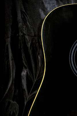
What I like in particular about the image of the guitar in ‘Black’, is the way the shape appears to have been reduced to two-dimensions, flattened out, leaving the composition to be defined by the edges of the instrument, the circular inlay around the hole and the subtle organic folds of the background cloth. There’s something luxurious and rich about this image.

‘White’ is a beautiful shot. The infrared renders the image into a winter landscape, as though everything has been touched by frost, and furthermore, the bird looks like a sculpture – an improbable pose frozen in time. It reminds me of the way early illustrators might choose an exaggerated piece of behaviour when they painted creatures (sometimes to use the whole page for their composition).

Continuous and Intermittent
You take a different approach to these two images, and they work equally as well in representing contrasts. In ‘Continuous’, there’s a double meaning with the railings running away in a strong diagonal up and across the frame, and the notion of a race still in progress, with evidence of dumped clothing and discarded water bottles. I think the narrative element is helped by the choice of a foreground focal point, with the remainder of the image in soft focus, left to our imagination.

You take an interesting approach to the interpretation ‘intermittent’ converting to monochrome and using colour accent to create the scattered points of the orange balloons. Good to see the making of meaning in the ‘darkroom’.

Many and Few
A good contrasting pair, with pigeons in motion and at rest on the rooftop. There’s a good rhythm about this shot; the birds in the sky, and the solitary creature perched on the column at the bottom of the frame creating a circular motion around the picture.

With ‘Few’, again a strong composition, capturing a (comical) trio in various poses. The strong backlight, shadows, and the dark background, help define the birds.

Large and Small
The (Dutch) angle and sepia monochrome of ‘Large’ help exaggerate the long shadow. The image has a noir or ‘graphic novel’ feel to it, the shadow mysterious, the distant city across the bridge, otherworldly.

Using layers of blur is an alternative way of creating the world of miniatures, rather than using a tilt-shift lens. I really like this shot. Again, it has an otherworldly feel abut it, like a set-design still from a performance of Gormengast. Tate Modern is a perfect setting for creating this kind of image – here the black and white produces a monolithic feel to the building.

Hard/Soft
The contrasting pair is well illustrated in this single image (great definition considering you're shooting through a window). The three-quarter backlight defines the layers of cloud shape and texture, while the plane’s rigid wing structure is highly defined against the clear blue sky – works well.

You’ve produced some excellent images here.

What have I learned?
Many of the subjects in my images would previously have been dismissed as not particularly interesting, but I now believe that there is photographic potential in just about everything! I had to do alot of thinking and planning before reaching for my camera, but I think this paid off as I've ended up with a range of subjects, lighting, and post-processing techniques.
At this stage of my development, I think it's safe (and important) to experiment and take 'risks' in order to learn what works and what doesn't, together with the underlying reasons.

Sunday 3 January 2010

Background Reading

When I was in Greenwich on Thursday, I went to Waterstone's and bought the following:

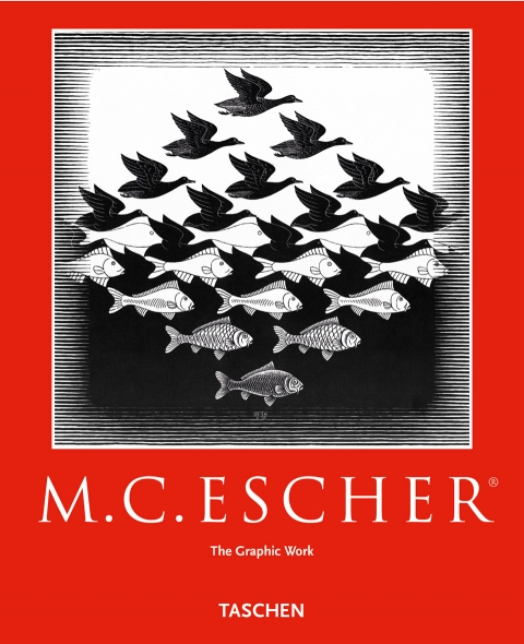
M.C.Escher - The Graphic Work
This book contains 76 reproductions which are introduced and explained by the artist himself. I have long been fascinated by his work, and thought it would be interesting to discover the thinking behind it.

M.C. Escher - The Graphic Work

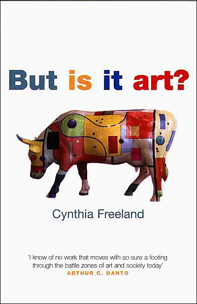
But is it Art? by Cynthia Freeland
This book looks at innovation and controversy in art. The concept of art is both emotive and subjective, and I thought this book might help me to understand why some items are considered 'art' as this has perplexed me in the past.

Cover Image

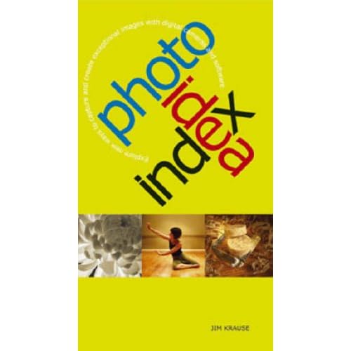
Photo Idea Index by Jim Krause
I bought this after briefly flicking through the pages because, unlike many other photography books that tell you the 'correct' way to do things, this one just looks at alternative ways of presenting a subject.


I also ordered the following from Amazon:

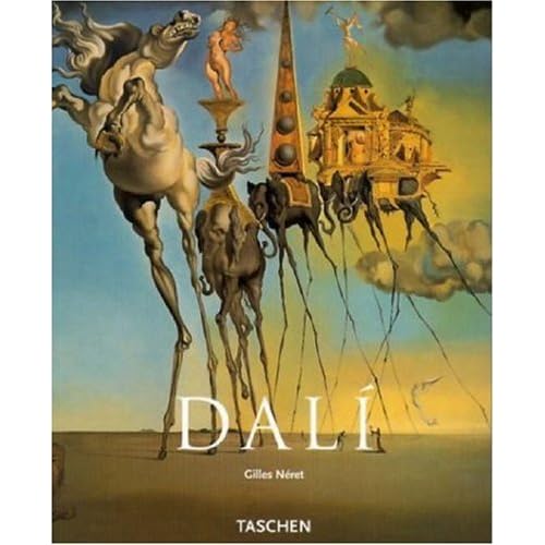
Dali by Catherine Plant
I have several posters depicting Dali's work, but I wanted to read something that would give an insight into his incredible mind.


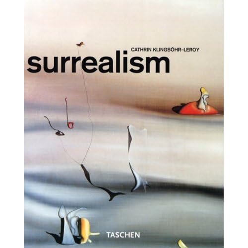
Surrealism by Cathrin Klinsohr-Leroy
I don't know much about this subject, though I like surrealist artwork. This book dicusses artists that I am not familiar with and showcases their work.


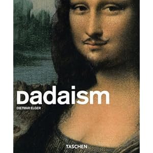
Dadaism by Dietmar Eiger
Dadaism was a forerunner of surrealism, and since I know absolutely nothing about this, I'm using this book to give me a brief introduction to it.

Dadaism (Taschen Basic Art Series)

Friday 1 January 2010

New Year's Day

I went for a walk in Clissold Park close, which is close to my home, and took this shot to represent 'straight':


I got this idea a few days ago - find something that is not straight, but shoot it at angle so it appears to be upright. So I was on the look out for wonky lamposts, buildings etc., and was very pleased to find this tree. This was the best angle because it showed the maximum incline, but the tree was in shade and there was sunlight in the background. I converted the image to black and white to prevent the bright green grass in the background from distracting from the drab soil in the foreground.

I went to Greenwich yesterday, primarily to take shots for my website, but I also decided to reattempt a shot of the Thames Flood Barrier that I'd struggled with in August. This picture has been cropped to show a section of one of the barriers, which is my interpretation of 'smooth':


The problem is that the shiny panels of the barrier are so highly reflective, I kept getting blown highlights. I remember reading about a professional photographer who wrote that Winter was his preferred time to take pictures because of the quality of light, and I discovered this for myself in the last few weeks as I haven't had problems with lens flare or hot spots which I had during the Summer.

For my final pair of contrasting images, I have chosen black/white. In infrared photography, anything that reflects infrared light shows up as white so I had quite a few possibilities. In the end, I opted for an image of a pelican that I took at London Zoo in July:

I was initially worried about not being able to show enough contrast in an image that is predominantly white, but there are several specks of black to prevent it from being totally washed out.

The image representing 'black' had me stumped until reading an article in February 2010's 'Practical Photography' magazine. In this article, the photographer took a picture in complete darkness, using a torch for illumination and the bulb setting for the shutter. I tried the same method using a black guitar propped up in front of some black satin material. I positioned the guitar, tripod and camera to reveal what it is, but hide the parts of it that are not black. I set the camera up with the light on, and then operated the shutter by remote control while 'painting' over the guitar with a torch. I had about 6 attempts at it, altering the aperture until I got an image that I was happy with, and this is it:


I have chosen this picture to show hard/soft:
This was taken in October 2009 on a flight to Egypt. I specifically chose a window seat that wasn't blocked out by the wing (this has happened to me before) and I was lucky that the sun wasn't too bright. I have imcreased the contrast to highlight the texture in the clouds and increased the saturation.

I made my Facebook Fan Page  public today!
I sent inbox messages to a few people who I thought were more likely to become fans. I'm aiming for about 40 in the first instance, and would like to see this number increase once the website has been launched.

What have I learned?
I have a better appreciation of the 'seasonal effects' on photography. The landscape has changed significantly - leaves falling off trees and low-lying plants killed by frost. Also, the light is less harsh and I personally find the sky more interesting (from an infrared point of view) because there are more clouds.
The contrast assignment has increased my range of subjects and techniques. It has also given me the opportunity to experiment and show familiar objects in new ways.