The postman has just delivered the result of my assessment for Art of Photography. I got 60% overall, which is equivalent to a 2:1. There are individual marks for skills, knowledge, invention, communication, and judgement.
The written feedback made references to my experimentation, inventiveness, and developing technical and communications skills. My work was described as 'visually engaging and showing emerging personal identity'.
What have I learned?
The detailed marks give an indication of areas that I can improve upon. This is something that I will bear in mind as I progress to the next module. It's not just about fulfilling the brief and taking interesting photographs, it's also about developing and demonstrating a specific skillset.
I'm very happy!
Showing posts with label Assignments. Show all posts
Showing posts with label Assignments. Show all posts
Thursday, 16 December 2010

Saturday, 9 October 2010

Friday, 24 September 2010
Assignment 5 - Tutor Feedback
The set of images submitted for Narrative Illustration, and the technical and reflective notes posted in your Blog, are of the same high standard of the previous assignments.
You reveal, through the twelve images, a carefully considered approach to what might have been a fairly generic and stereotyped project. Once again, you demonstrate a strong technical knowledge with an individual eye, to produce an alternative take on both iconic NYC images, and those less obvious, but equally engaging.
Cover Shot
With OG in the background, the detail of the George Washington bronze statue is immediately recognisable. The reduced saturation of the background helps lift and enhance the texture and colour of the dark metal, and the angle of light – three quarter back – brings out the form. I might have been tempted to shift the position to the right a touch, to bring the statue detail to the right of frame, and capture the flag in its entirety, just to tighten up the frame.
Central Park
There is some lovely detail in this shot, which works particularly well for the composition, with the grain in the decking bringing an extra dimension to the vanishing point effect. Similarly, the cross shadows and the dappled light on the bridge draws the eye forward curving towards the small group of visitors in the background. It’s an image that speaks of place. There’s also a great balance of colour, light, and shade across the dynamic range.
Bethesda Terrace in Central Park
This is a difficult image to expose correctly, with what must be a six-stop variation between the interior and the exterior. Here, you’ve managed to get a good balance with a bit of over exposure outside, but a nice feel to the light in the foreground. The reflected light on the ceiling and the floor provides a good graduation, and a partial silhouette of the mid-ground figures. Of the possibilities that I would consider for composition, the movement of passing figures is one, and the other would be, as in the previous image, to focus on the details of the building. This works well.
Museum
This shot of the Asian sculpture in the Met, provides a complementary feel to the previous image, with a flat, natural light creating a spacious feel and, with the comparatively small figure of your friend, the monumental size of the figure. This shot works well to create a feeling of space and light; an alternative might be to look for some interesting (close) foreground detail, or perhaps get low an behind your friend to exaggerate the towering figure in front of her – all technical challenges.
Street Art
This following image of the bright Pop Art street sculpture is the perfect cultural complement of the formal Met exhibit. It shouts NYC, big, bright with saturated colour. It’s good that you managed to get a clear shot of the piece, and spent some time looking around I, and the background to get the feel that you wanted. I like the fact that you captured the buildings on the corner, with the diagonals running back and to the edges of the frame to give the whole mage a clear perspective.
Food
I think you’re right about the aperture; a more distinct brand logo would help sell the city here. While the detail on the cake, texture, colour form is very good, you do just crop the slice a bit, and the centred composition leaves (for me) too much negative space to the left of the frame. Maybe a piece out of it, and a fork across the frame would balance the shot?
Shopping
I like the balance of the composition here, the figure to the left checking out the goods, with the display of bags on the wall behind, and the way you’ve captured the natural action. The auto WB works well enough here – fluorescents can be horrible in mixed light situations. What it needs – and hard to do in a location, with an impromptu shot – is a bit of reflected light from low in front of the camera, just to lift the face, and get a bit more light onto the bag she is holding.
New York Bay
Interesting shot of the container ferry making its way across the bay. Maybe it needs a bit of a more recognisable skyline to speak ‘city’, docks, or a partial glimpse of the Statue of Liberty? I think the flat light helps with the complex internal structure of the vessel, with the sky and water nicely captured and providing regular textural surroundings for the rigid grid-like patterns on the boat.
Empire State
I like this shot very much. Both concept and execution are strong. The deco interior is beautifully captured with the model, flag, memorial, clerk and vase of sunflowers providing an interesting variation in subject. I think maybe either it needs to be a touch wider to capture the sign to the right of frame, or tighter to eliminate it. The top light gives it an almost otherworldly feel, an austerity or formality and gravity. Very nice.
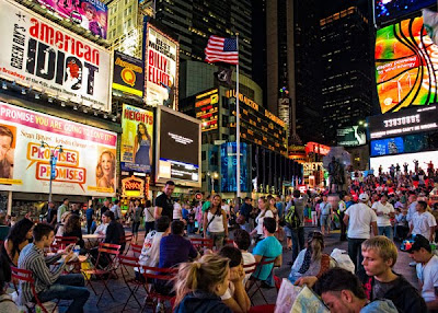
Times Square
While it appears at first that there is no particular point to which the eye is drawn, and it does indeed reflect the movement and chaos of Times Square, eventually the eye does fall on the flag, and the young person standing to the left, and the group of people around her. There’s a good exposure balance here, with the street signs nicely exposed, and enough attention to foreground reflected light to see the detail of the people. I also find myself looking towards the right of frame, and what appears to be a group of musicians silhouetted against a white background – might be an electronic image…
New York Characters
Classic bit of street photography with the Naked Cowboy defined against the backdrop of daytime TSq – the use of the long lens softens the background and the strong(er) midday light helps define the figure’s anatomy. I’d be tempted to do a bit of a subtle mask job on this and throw the background out even more – or maybe experiment with a graduated blur. My enduring street character memory was the roller skating guitar playing Jimi Hendrix impersonator, amp strapped to his back.
NYPD
Along with the Empire State image, this shot of the giant policeman giving directions to the diminutive woman is my pick of the set. The body language speaks of lost in the metropolis, and as you say, the architectural lines enhance this, while the background masonry confirms the cultural heritage of an old city. The light adds a kind of ‘annunciation’ effect, like an old master painting, compressing and focussing the composition.
So, strong and well considered images, avoiding the cliché of the world’s most famous city, and offering a different vision. Technically, the exploration of and determination to deal with different and challenging lighting and environmental situations shows how much you’ve taken on board (and mastered) on this course.
Very well done.
You reveal, through the twelve images, a carefully considered approach to what might have been a fairly generic and stereotyped project. Once again, you demonstrate a strong technical knowledge with an individual eye, to produce an alternative take on both iconic NYC images, and those less obvious, but equally engaging.
Cover Shot
With OG in the background, the detail of the George Washington bronze statue is immediately recognisable. The reduced saturation of the background helps lift and enhance the texture and colour of the dark metal, and the angle of light – three quarter back – brings out the form. I might have been tempted to shift the position to the right a touch, to bring the statue detail to the right of frame, and capture the flag in its entirety, just to tighten up the frame.
Central Park
There is some lovely detail in this shot, which works particularly well for the composition, with the grain in the decking bringing an extra dimension to the vanishing point effect. Similarly, the cross shadows and the dappled light on the bridge draws the eye forward curving towards the small group of visitors in the background. It’s an image that speaks of place. There’s also a great balance of colour, light, and shade across the dynamic range.
Bethesda Terrace in Central Park
This is a difficult image to expose correctly, with what must be a six-stop variation between the interior and the exterior. Here, you’ve managed to get a good balance with a bit of over exposure outside, but a nice feel to the light in the foreground. The reflected light on the ceiling and the floor provides a good graduation, and a partial silhouette of the mid-ground figures. Of the possibilities that I would consider for composition, the movement of passing figures is one, and the other would be, as in the previous image, to focus on the details of the building. This works well.
Museum
This shot of the Asian sculpture in the Met, provides a complementary feel to the previous image, with a flat, natural light creating a spacious feel and, with the comparatively small figure of your friend, the monumental size of the figure. This shot works well to create a feeling of space and light; an alternative might be to look for some interesting (close) foreground detail, or perhaps get low an behind your friend to exaggerate the towering figure in front of her – all technical challenges.
Street Art
This following image of the bright Pop Art street sculpture is the perfect cultural complement of the formal Met exhibit. It shouts NYC, big, bright with saturated colour. It’s good that you managed to get a clear shot of the piece, and spent some time looking around I, and the background to get the feel that you wanted. I like the fact that you captured the buildings on the corner, with the diagonals running back and to the edges of the frame to give the whole mage a clear perspective.
Food
I think you’re right about the aperture; a more distinct brand logo would help sell the city here. While the detail on the cake, texture, colour form is very good, you do just crop the slice a bit, and the centred composition leaves (for me) too much negative space to the left of the frame. Maybe a piece out of it, and a fork across the frame would balance the shot?
Shopping
I like the balance of the composition here, the figure to the left checking out the goods, with the display of bags on the wall behind, and the way you’ve captured the natural action. The auto WB works well enough here – fluorescents can be horrible in mixed light situations. What it needs – and hard to do in a location, with an impromptu shot – is a bit of reflected light from low in front of the camera, just to lift the face, and get a bit more light onto the bag she is holding.
New York Bay
Interesting shot of the container ferry making its way across the bay. Maybe it needs a bit of a more recognisable skyline to speak ‘city’, docks, or a partial glimpse of the Statue of Liberty? I think the flat light helps with the complex internal structure of the vessel, with the sky and water nicely captured and providing regular textural surroundings for the rigid grid-like patterns on the boat.
Empire State
I like this shot very much. Both concept and execution are strong. The deco interior is beautifully captured with the model, flag, memorial, clerk and vase of sunflowers providing an interesting variation in subject. I think maybe either it needs to be a touch wider to capture the sign to the right of frame, or tighter to eliminate it. The top light gives it an almost otherworldly feel, an austerity or formality and gravity. Very nice.
Times Square
While it appears at first that there is no particular point to which the eye is drawn, and it does indeed reflect the movement and chaos of Times Square, eventually the eye does fall on the flag, and the young person standing to the left, and the group of people around her. There’s a good exposure balance here, with the street signs nicely exposed, and enough attention to foreground reflected light to see the detail of the people. I also find myself looking towards the right of frame, and what appears to be a group of musicians silhouetted against a white background – might be an electronic image…
New York Characters
Classic bit of street photography with the Naked Cowboy defined against the backdrop of daytime TSq – the use of the long lens softens the background and the strong(er) midday light helps define the figure’s anatomy. I’d be tempted to do a bit of a subtle mask job on this and throw the background out even more – or maybe experiment with a graduated blur. My enduring street character memory was the roller skating guitar playing Jimi Hendrix impersonator, amp strapped to his back.
NYPD
Along with the Empire State image, this shot of the giant policeman giving directions to the diminutive woman is my pick of the set. The body language speaks of lost in the metropolis, and as you say, the architectural lines enhance this, while the background masonry confirms the cultural heritage of an old city. The light adds a kind of ‘annunciation’ effect, like an old master painting, compressing and focussing the composition.
So, strong and well considered images, avoiding the cliché of the world’s most famous city, and offering a different vision. Technically, the exploration of and determination to deal with different and challenging lighting and environmental situations shows how much you’ve taken on board (and mastered) on this course.
Very well done.
Tuesday, 14 September 2010
Assignment 5 - Narrative and Illustration
Brief:
Imagine that you are about to illustrate a story for a magazine. You have a cover to illustrate and several pages inside (between 6 and 12). Write captions to explain and link each picture.
My chosen theme for this assignment is 'New York' as I recently visited the city for the very first time. I decided that my 'magazine' would highlight things to see and do for anyone visiting the city, but I didn't want to simply replicate the numerous tourist guides that are already available.
In addition to scenery and architecture, I wanted my images to capture the quirkiness and uniqueness of the city and the people who live and work there.
Magazine Cover - New York




I packed quite alot into my 10-day visit to New York and it was also difficult to narrow down the focus of the assignment. I toyed with the idea of concentrating on a specific part of the city, e.g. Central Park. I then thought about documenting an excursion, e.g. visiting Staten Island. I didn't think either of these were particularly interesting in themselves and there was so much more about this vibrant city that I wanted to get across.
I also wanted to experiment with different types of lighting and I could only do this by incorporating multiple locations.
Overall, this course has taught me that there is much planning involved in achieving good photography. I have started to pre-visualise, which increases the number of shots that I will eventually keep, and saves me time when processing the image since I have a fair idea about what I am going to do with it from the moment it is taken.
I have a much better appreciation of the quality of light, and I'm prepared to walk away from a location if the light is not right. I am also better at selecting and using appropriate light modifiers.
I am more confident in my approach and willing to experiment. I can see a distinct improvement in the quality of my images and I think I am starting to develop my own style.
Imagine that you are about to illustrate a story for a magazine. You have a cover to illustrate and several pages inside (between 6 and 12). Write captions to explain and link each picture.
My chosen theme for this assignment is 'New York' as I recently visited the city for the very first time. I decided that my 'magazine' would highlight things to see and do for anyone visiting the city, but I didn't want to simply replicate the numerous tourist guides that are already available.
In addition to scenery and architecture, I wanted my images to capture the quirkiness and uniqueness of the city and the people who live and work there.
Magazine Cover - New York

This is a statue of George Washington on the steps of Federal Hall, opposite the New York Stock Exchange. I originally took a picture of the Stock Exchange building by itself, and spotted this composition while walking around the statue.
I wanted something iconic for the magazine cover, and they don't come much more iconic than George Washington and 'Old Glory'! This is also an example of juxtaposition.
I have given prominence to the statue by boosting the tonal contrast, which gives it form. I have also reduced the saturation of the Stock Exchange in the background which, together with a large aperture, helps it to recede and gives the image perspective.
Page 1 - Central Park

Most people associate New York with hustle and bustle, and even in a beautiful green space like Central Park people still travel at speed, running, cycling or roller-blading. Fortunately, the people on this bridge were strolling which allowed me enough time to set up the shot.
I like the converging the lines in this image and opted for a low perspective in order to exaggerate them. Hard light is not always a pleasant feature in a photograph, but I like the way that the shadows bisect the bridge, and the people have conveniently lined up at the point of interest.
Page 2 - Bethesda Terrace, Central Park

I stumbled upon this amazing terrace by accident and then struggled for ages with the lighting! It was impossible to correctly expose for the brightly light exterior and the dim interior, even using matrix metering. Ideally, I would have liked to have used bracketing, but I didn't know how to cope with the 'ghosting' that arises from moving subjects. I do now, so I'll be ready next time.
I experimented with various white balance settings, and finally chose the shade setting which I had to tone down as it was a little too warm. The ISO was set to 3200 and shutter speed was 1/40 to give the suggestion of movement.
Page 3 - Museums

This is a shot of my friend Janini in the Metropolitan Museum of Art. The lighting in the larger rooms was perfect - lots of large white surfaces and minimal artificial lighting. In this image, I was trying to show contrast between the relative sizes of Janini and this impressive exhibit.
Page 4 - Street Art

In addition to museums and galleries, there are several examples of sculptures and paintings around the streets of New York. This was one of the more popular sculptures, and I had to get up early to get this shot. Not just to avoid hard light, but also the numerous tourists who were always crowded around it to have their pictures taken in front of it.
The subject had a reflective surface so I used an oblique angle to show some texture. I also tried the shot from the left of the sculpture, but the buildings and streets on the right made a more pleasing image.
Page 5 - Food

I took the opportunity to set up a still life shot of a slice of carrot cake that I bought from the Magnolia Bakery. This famous bakery is credited with starting the craze for cupcakes.
I set this up in diffused window light in my hotel room during late afternoon. I placed the cake box just behind, with the name of the bakery visible. I used a small aperture to give maximum attention to the cake, but looking at the final image, I would have liked a slightly larger aperture to make the name of the bakery more legible.
Page 6 - Shopping

This is my friend Janini browsing in the Fendi store. I took this shot without looking through the viewfinder - the camera was around my neck and I used a spirit level mounted on the hot shoe to keep the camera straight. Consequently I managed to capture a very natural looking pose.
I used an auto white balance setting because there was a mixture of fluorescent lighting and natural light, and a slight colour cast had to be removed in post-processing.
Page 7 - New York Bay

I took this on the Staten Island Ferry. According to my New York city guide, "this 20-minute trip offers excellent views of the Statue of Liberty and Manhattan skyline". The boats, yachts and other ferries sailing in the bay were therefore an unexpected photographic opportunity.
This cargo ship was an interesting mix of contrasting colours and I chose to shoot two planes instead of a side or rear view, to give it form. The lighting was generally quite flat, but the shadow cast by the underside provides depth.
Page 8 - Empire State Building

Most of the information about this building concentrates on its external features - the Art Deco design and its enormous height. I thought the internal features were far more impressive though challenging to photograph. There were reflective surfaces everywhere and the pop-up flashes of my fellow tourists increased the number of potential hotspots. I seized the opportunity to get my shot while there was a lull in photographic activity - several people were having their pictures taken in front of the replica on the left.
I had to push the ISO up to 3200 and shot wide open at f/2.8 to get a decent exposure. This was also taken without looking through the viewfinder so as not to distract the desk clerk.
The artificial light combined with an auto white balance setting gave the image a yellow cast that I removed in post-processing.
Page 9 - Times Square

I chose Times Square as a location for some night photography. This reminded me of the 'Outdoors at Night' exercise in the Lighting Techniques section of the course.
There isn't anywhere for the eye to settle in this image, but this is quite deliberate because that's exactly what being there was like. There are numerous sources of artificial light in Times Square, but I also wanted to get in amongst the people hanging around the place as they are just as important as the advertising billboards.
This was also taken without looking through the viewfinder which allowed me to work relatively unnoticed.
Page 10 - New York Characters

This is the 'Naked Cowboy' who I encountered in Times Square. I think this is an illustrative shot representing the madcap characters who frequent Times Square and keep the public amused.
My original intention was to take shots of Times Square during the daytime, so as to compare with the atmosphere in the evenings. The Naked Cowboy provided me with some some foreground interest and I chose an aperture of f/4.0 to lessen the impact of the advertising hoardings.
Page 11 - NYPD

New York is a place in which me and friends all felt very safe. I think this was mainly due to a strong police presence on just about every street.
This is the only shot I have of the police interacting with the public so it stands out from the others. I took this on Wall Street and particularly liked the lines created by the fence and the wall. When the police officer pointed in the same direction, this was an added bonus!
I also like the spotlight effect that the light has in lifting the subjects out of the shade.
What have I learned?
This assignment turned out to be trickier than it first appeared. As suggested by the study guide, I tried to incorporate everything that I have learned on the course so far. This was no mean feat with only 12 shots to play with.I packed quite alot into my 10-day visit to New York and it was also difficult to narrow down the focus of the assignment. I toyed with the idea of concentrating on a specific part of the city, e.g. Central Park. I then thought about documenting an excursion, e.g. visiting Staten Island. I didn't think either of these were particularly interesting in themselves and there was so much more about this vibrant city that I wanted to get across.
I also wanted to experiment with different types of lighting and I could only do this by incorporating multiple locations.
Overall, this course has taught me that there is much planning involved in achieving good photography. I have started to pre-visualise, which increases the number of shots that I will eventually keep, and saves me time when processing the image since I have a fair idea about what I am going to do with it from the moment it is taken.
I have a much better appreciation of the quality of light, and I'm prepared to walk away from a location if the light is not right. I am also better at selecting and using appropriate light modifiers.
I am more confident in my approach and willing to experiment. I can see a distinct improvement in the quality of my images and I think I am starting to develop my own style.
Monday, 30 August 2010
Assignment 4 - Tutor Feedback
You chose a good object for this study, in some aspects simple, but in others quite challenging to photograph. Anything, which is reflective and/or transparent, is going to require quite a bit of thought and preparation. Looking at this submission as a set of thumbnails, you have really explored the glass bowl; looking at angles and height, in addition to and to complement the individual approach to each image. In addition, looking through the other exercises in your blog, you have spent some considerable time exploring the idea of light – natural and artificial – and the way that can impact on any image. Lighting plays such a vital role in the way an image can be captured, and it is no easy thing to control or master.
Shape
The use of a backlight, a black background, and that nicely controlled crescent of light on the ‘ground’ helps to define the shape of this glass bowl. The outline (rim) is well defined, although the glass is quite difficult to light in this way. I particularly like the inconsistency and variation in the light around the rim. As you say in your reflection, the act that the object is transparent means that the entire shape is rendered, rather than just the silhouette, bringing some sense of depth and multi-layered textures to the image.
The second, closer detail shot is very nice, capturing a real sense of the texture and feel of the piece. The use of a longer lens to create a greater depth of field and throw the background into soft focus complements and enhances the object. There is a lovely clarity about the colour and texture here, it looks, exactly I imagine, as the artist hoped, like something fluid and molten captured in time. I think you’re right about the square format, it really helps the composition.
Form
Interestingly, because of the nature of the substance, and the way it has been cast/blown, the use of fill is probably redundant because the light from the key is captured and reflected in the glass. There is a good sense of the form of the object in both images, and while I’m not a great fan of monochrome conversions in digital work, the second image works well in establishing and defining the volume of the object. I might have favoured a slightly higher and oblique angle in the first (colour) image to get a three-dimensional feel of the bowl, but you have managed to capture the curving rim very well here. In the second image, the oblique positioning of the piece helps, although it needs to be either further away from the backdrop, or shot with a longer lens and lower stop to reduce the DOF and eliminate the creases in the cloth.
Texture
The textbooks are right about capturing texture, lights placed at acute angles will capture any roughness or blemishes and produce shadows, but this is tricky with glass because of the smooth surface. The texture in the bowl is mostly inside the material, although with the second image, there is a good sense of the ridges and waves. However, the material is nicely captured here, and there is a good sense of the feel of the object, its smoothness, the flowing surface. The shadows cast by the bowl are worth exploring – I like the pattern cast onto the ground in the second shot, it too, helps to define the nature of the object.
Colour
The use of a black and a white backdrop to explore the colour of the object is a good approach in these two images. The first, from above, is a strong and unusual angle, which makes the (already exotic) piece, look like some strange sea creature captured in shallow water. The colour here is good as the shadow level, and thus contrast is quite low and this renders the greens bright and clear. In the second image, your idea of backdrop and ground in black to crate a floating effect is very good; all elements of the object, shape, form, texture and colour are present here.
So, this is another well-considered and produced assignment, demonstrating both a high level of commitment to exploring lighting technique, and an excellent practical outcome. I think books about lighting techniques have their place, but there is no substitute for exploration and experimentation. But what I do know, is once we understand how to begin to control and manipulate light (and shade), both interior and exterior, then we really begin to understand the nature of photography. Always carry a reflector...
Shape
The use of a backlight, a black background, and that nicely controlled crescent of light on the ‘ground’ helps to define the shape of this glass bowl. The outline (rim) is well defined, although the glass is quite difficult to light in this way. I particularly like the inconsistency and variation in the light around the rim. As you say in your reflection, the act that the object is transparent means that the entire shape is rendered, rather than just the silhouette, bringing some sense of depth and multi-layered textures to the image.
The second, closer detail shot is very nice, capturing a real sense of the texture and feel of the piece. The use of a longer lens to create a greater depth of field and throw the background into soft focus complements and enhances the object. There is a lovely clarity about the colour and texture here, it looks, exactly I imagine, as the artist hoped, like something fluid and molten captured in time. I think you’re right about the square format, it really helps the composition.
Form
Interestingly, because of the nature of the substance, and the way it has been cast/blown, the use of fill is probably redundant because the light from the key is captured and reflected in the glass. There is a good sense of the form of the object in both images, and while I’m not a great fan of monochrome conversions in digital work, the second image works well in establishing and defining the volume of the object. I might have favoured a slightly higher and oblique angle in the first (colour) image to get a three-dimensional feel of the bowl, but you have managed to capture the curving rim very well here. In the second image, the oblique positioning of the piece helps, although it needs to be either further away from the backdrop, or shot with a longer lens and lower stop to reduce the DOF and eliminate the creases in the cloth.
Texture
The textbooks are right about capturing texture, lights placed at acute angles will capture any roughness or blemishes and produce shadows, but this is tricky with glass because of the smooth surface. The texture in the bowl is mostly inside the material, although with the second image, there is a good sense of the ridges and waves. However, the material is nicely captured here, and there is a good sense of the feel of the object, its smoothness, the flowing surface. The shadows cast by the bowl are worth exploring – I like the pattern cast onto the ground in the second shot, it too, helps to define the nature of the object.
Colour
The use of a black and a white backdrop to explore the colour of the object is a good approach in these two images. The first, from above, is a strong and unusual angle, which makes the (already exotic) piece, look like some strange sea creature captured in shallow water. The colour here is good as the shadow level, and thus contrast is quite low and this renders the greens bright and clear. In the second image, your idea of backdrop and ground in black to crate a floating effect is very good; all elements of the object, shape, form, texture and colour are present here.
So, this is another well-considered and produced assignment, demonstrating both a high level of commitment to exploring lighting technique, and an excellent practical outcome. I think books about lighting techniques have their place, but there is no substitute for exploration and experimentation. But what I do know, is once we understand how to begin to control and manipulate light (and shade), both interior and exterior, then we really begin to understand the nature of photography. Always carry a reflector...
Thursday, 26 August 2010
Assignment 4 - Lighting Techniques
Brief:
Choose any subject that you can move around and take about eight photographs of it, each in a different kind of lighting. You can use any light at all, from daylight to available artificial light, to photographic lighting.
You should aim to show the following qualities of your subject, one at a time by means of lighting:
The images for this assignment were taken on August 7, 8, 11, yesterday and today. As well as experimenting with different backgrounds, I also wanted to test the light at various times of day, both indoors and outdoors. I also referred to this book:


I was trying to show the characteristics of the dish in this image, ie that it was made from glass and therefore transparent. For that reason, I decided to light it from directly above using a diffused video light. Ordinarily this type of non-directional lighting is not particularly flattering, but it served a useful purpose in this exercise.
Choose any subject that you can move around and take about eight photographs of it, each in a different kind of lighting. You can use any light at all, from daylight to available artificial light, to photographic lighting.
You should aim to show the following qualities of your subject, one at a time by means of lighting:
- Shape - This quality has to do with the outline of an object
- Form - This another way of describing the volume of an object
- Texture - This is quality of the surface detail
- Colour - Choose a kind of lighting and exposure setting that shows the subject's colour as strongly as possible.
The images for this assignment were taken on August 7, 8, 11, yesterday and today. As well as experimenting with different backgrounds, I also wanted to test the light at various times of day, both indoors and outdoors. I also referred to this book:
Though very technical, it helped me to think about lighting set-ups to achieve the desired results. I couldn't really digest all of the contents at this time, so I will definitely revisit it from time to time.
Shape

The subject for this assignment was an ornamental glass dish belonging to my mother. This picture was taken in my kitchen using a black backdrop and velvet 'tablecloth'. The curtains were drawn to eliminate any incidental light.
For this set-up, the camera was on a tripod and a video light, with diffuser was directly behind the object. Due to the thickness of the dish and the relatively small size of the light source, I was able to place the video light very close to it.
A solid object would have resulted in a silhouette with rim lighting, but in this instance the dish has been illuminated, which separates it from the background and (literally) highlights the shape.

This was taken outdoors, holding the dish up to the sky. I tried this shot using all of the white balance settings on my camera and finally settled on this one, which uses the shade setting.
I like the cool green against the warm background - a combination I encountered during the last (colour) assignment. The other white balance settings produced pleasing results, but I felt that those colour combinations were a little overwhelming and detracted from the shape of the dish, which was my primary focus.
I cropped the final image to a square because I think this enhances the curves and diagonals and makes for a more dynamic shot.
Form
I cropped the final image to a square because I think this enhances the curves and diagonals and makes for a more dynamic shot.
Form

My main objective for this category was to show uneven lighting and contrast, which is what I would expect from a three-dimensional object. I have placed the video light on the left (just out of shot) with no fill-light, to make the contrast as stark as possible. I also took this shot with the light on the right, and the results were pretty much the same. The video light was diffused to limit the number of blown highlights.

This was shot indoors using an infrared camera. Light came from a window on the left, diffused by net curtains. I was trying to show the form of the object in an abstract way by eliminating the colour. I tilted the dish by placing it one a roll of sellotape under the velvet 'tablecloth' to change the viewpoint.
Texture

I read that in order to show texture, I would need a small light source at a low angle so that was the set up I used for this image. A video light was placed just out of shot, angled towards the dish. I also used barndoors to restrict the spread of light so that it would be concentrated on the dish.

Colour


I wanted a clean background to accentuate the colour of the object, so I opted for a white 'tablecloth' for this particular set-up. The camera was directly above the dish, on a tripod whilst light was provided by off camera flash from the top left corner. I underexposed by one third of a stop to enhance the colour of the dish, so the background is not as white as it should be but still contrasts with the dish.

Again, I was trying to make the colour of the dish contrast from the background. This time around, I used a video light as the main light source and underexposed. As a result, the backdrop is indistinguishable from the cloth on which the dish was placed, but I think this helps make the dish stand out.
What have I learned?
Some knowledge and understanding of lighting techniques provides a useful starting point, and it's handy to know that certain results may be replicated when required, but there are no hard and fast rules for lighting a subject because there are so many variables involved.
Friday, 18 June 2010
Assignment 3 - Tutor Feedback
Most people taking this course find the colour assignment the trickiest. It isn’t the easiest task to find the required combinations in one or two outings, so a mix of stand-alone images and technical shots is a good approach. Something you’ve done here, along with the detailed diagrams and good notes for both.
Colour Harmony through Complementary Colours
This set of four images and diagrams illustrates perfectly the harmonious possibilities in a variety of complementary colourways, with the diagrams illustrate the movement in the frame.
I think the bud, in the image of the rose, helps strengthen the composition and guide the movement towards the flower head. The red here, is highly saturated (is that using PS?), and seems to have lost some of its texture and detail, but it’s nicely defined against the soft focus greens in the background.
There’s a gentler feel to the following shot of oranges in a bowl. This might be partly due to the soft, low light on the subject – feels a bit underexposed here, although the angle lifts the skin texture on the fruit. There is a strong compositional conflict between the subject and the chrome basket.
The graffiti detail on the London wall works very well with the shapes and the complementary colours producing an unusual, organic movement around the frame. As you say in your notes it is almost circular, and the purple/yellow combination – much loved by hippies all around the world – is effective and pleasing.
The following close detail of the tomato and stalk produces a quite different movement, well defined in your diagram. The colour, and particularly the texture details, are excellent in this shot – a beautiful lens, the 105mm.
Colour Harmony Through Similar Colours
This is a strong and interesting set, with a real variety of subject matter and approach to composition, in which you demonstrate harmony similar colours perfectly.
The shot of the flower from above, perfectly positioned in the frame, contains a really good range of detail across the dynamic range, and although there is a good depth of field, it is the colour that distinguishes the flower head. I’m picking up a circular movement around the flower in this image.
With the landscape image, while the flat light lowers the level of contrast and facilitates the idea of similar colour harmony, I think the shot would work in fill strong light. The colours define the composition, but the real strength is the positive/negative shape, of the rising hill against the skyline.
Playground artifacts or contemporary sculpture, interesting how design and fine art are so close, especially when, as in this image, the structure is ambiguous. The three plains fall back, defined by the red, orange and yellow elements, creating a nice sense of space (and harmony).
I’m never sure about this type of shot, although there are certainly a range of harmonious similar colours here, and a sense of rhythm around the frame. It’s crying out for something, an imperfection or an anomalous addition to attract the eye.
Colour Contrast through Contrasting Colour
The first two images in this set are really intriguing; with a highly effective use of infra red and polarizing filters. Polarisers, of course, produce the most beautiful range of colour and tone in the right light, as well as cutting out surface reflections. The landscape here in Kew, is classic, with strong cloud detail and a well balanced foreground of lake divided by the tree line. Interestingly, for me, it’s the sky and the refection that are the real strengths of the image. With the previous image, the sky is most striking, with a great sense of movement, and the tropical house shimmers below – I think the contrast is pretty minimal here, although the wall does underline the shot.
The lifeguard on the beach could be either contrasting, or colour accent, but works very well, with the use of a long lens to create foreshortening, and the similar colour range of beach and tidal pools.
The close shot of the poppy, similarly to the earlier image of the rose, is heavily saturated here, and I’m missing most of the purple at the centre of the flower head. I wonder if this is just the transfer to PDF – or the reduction of detail in the jpeg transfer?
Colour Accent
This is the element of the assignment that people tend to find hardest to deal with – examples are out there, but sometimes need a bit of patience. This set of four is pretty good, with the red bin accented against the field of green. The strong light is crucial here, saturating the colours and making the red accent stand out even more.
Yes, there’s a humorous relationship in both the size and the angle between the seagull and girl – looks like a morsel ready to be picked off. The orange top worn by the girl really helps her to stand out as a small and distant subject, and the eye moves between the two, as you show in your diagram.
I see a different dynamic (an additional one I should say) in the following shot of the inflatable in the surf, with the direction coming from the horizon, down with the approaching waves. The small craft would always attract the eye as it’s so different, breaking up the rolling horizontals of the waves, but the yellow accent helps define the effect.
When you look at the colour of the IronBru, and then at the effect it appears to have on the paperclips, you ask yourself what they put in it… even the same(ish) colour on colour can work as an accent very well, with the hue and distinct shape of the objects drawing the eye – but, the movement travels around them, too for me.
Your reflective summary is very good, and as you say, this is an assignment which makes you look at images in a different way. Here you prove that you have been successful and effective in that process – well done
Thursday, 10 June 2010
Assignment 3 - Colour
Brief:
Take about four photographs each (16 altogether) that illustrate the following colour relationships:
Colour Harmony Through Complementary Colours
Red & Green


Orange & Blue


Take about four photographs each (16 altogether) that illustrate the following colour relationships:
- Colour harmony through complementary colours (colours that face each other across the circle)
- Colour harmony through similar colours (those near each other, as in a cool or warm range of colours)
- Colour contrast through contrasting colours (colours spaced about a third of the way around the circle)
- Colour accent using any of the above ( a small area of colour which sits against a much larger background of another colour as a spot or accent)
Colour Harmony Through Complementary Colours
Red & Green

This was taken at Kew Gardens, a couple of weeks ago. I placed the rose on a rule of thirds hot spot, but also wanted to include the bud for added interest.

The stem acts as a leading line, but also, the stark red against the cool background makes the flower 'pop' and draws the eye to it.
Warm colours colours are sometimes described as 'aggressive' whereas cool colours are 'regressive'. This concept works in this image because the rose is in the foreground and the leaves disappear into the background.
Orange & Blue

This is a shot of oranges in a chrome fruit bowl, with the camera tripod mounted and pointing up. I used a tungsten white balance to achieve the blue background, and the inspiration for this came from Joe McNally's "The Hot Shoe Diaries".
The orange:blue ratio of 1:2 has been ignored because even though the orange colour occupies most of the frame, it does not over-dominate because it is being broken up by the chrome bars.

As demonstrated in the previous section (Elements of Design), curves suggest movement. In this example, the fruit bowl and the shape of the oranges imply movement across the image in all directions. The repetitive pattern also gives rhythm. This is another example of a warm foreground against a cool background which reinforces the relative importance of the oranges in the frame.
Yellow & Violet

This is a section from some graffitti in the East End of London. Violet is a tricky colour to find, and this colour appeared much lighter in reality than it does on my monitor!
I shot it at an oblique angle to retain the texture in the surface, but also to eliminate other colours. I tried to incorporate more violet than yellow to show a 1:3 division, which was made difficult due to the nature of the design and my angle of view.

The curves lead the eye around the image in a random, but almost circular manner. The yellow colour occupies a smaller surface area than the violet, and because yellow is brighter, I suppose this makes it 'easier on the eye'. This image is two-dimensional so I'm not conscious of any tension between the colours.
Red & Green

This is a macro shot of a tomato taken with the Nikon 105mm. Of all the complementary colours, the red/green combination appears to be the most prevalent, in plants especially. I have filled the frame with the stem as it is usually such a small and not so significant part of the fruit, and I tried to aim for the 1:1 balance between to the colours.

This is another random visual journey but the red:green combination is different because this time the background is red. The stem is so prominent in the frame, it doesn't appear to be regressing. Also, the red is graduated due to the incidence of light, and so does not consume the green colour.
Colour Harmony Through Similar Colours
Cool Colours

This was taken at Kew Gardens, and does not contain any warm tones. I have cropped to remove part of another flower in the top right corner. There is a little detail in the background, but not enough for it to detract from the flower.

The edges of the leaves in the background have caught the light, and all seem to point in the general direction of the flower. The petals are spread to display the central part, which is also a vivid shade.

This was taken in St Ives. The scene is almost equally balanced between cool blue and green hues, with the house providing some interest where they intersect.

The house is at the top of a hill so the slopes on either side act as leading lines. Originally, I thought the house might be slightly yellow, but the colour picker in Photoshop rendered it grey.
Warm Colours

This was taken in the playground of a local park. The colours are garish because they are aimed at very young children.


There are many interesting shapes in this structure, primarily because of the target audience. There is no main focal point - framing was chosen to exclude other unwanted elements.

In this shot of my garden wall, I have chosen a subject with a range of warm tones, rather than solid blocks of colour as per the previous example.


There is a range of warm tones which blend together. Again, there is no overall focal point so I cannot see any specific movement - it's quite arbitrary.
Colour Contrast Through Contrasting Colours

This is the Palm House at Kew Gardens taken using an infrared filter. I swapped the red and blue channels in Photoshop which is a common technique in infrared photography to achieve a blue sky. I particularly like the effect of the long exposure (30 seconds) on the clouds and people passing through the frame.

Apart from movement suggested by curves and the clouds, it was difficult to identify other forms of movement as there is quite alot going on in this picture. Blue is dominant in both the foreground and background and the palmhouse itself is a mixture of contrasting blue and red tones.

Another shot from Kew Gardens, this time using a polarising filter. The only adjustments made in Photoshop were levels and curves. The effect of the filter has enhanced the contrast between the different shades of yellow, and the blue sky.

Initially, the eye is immediately drawn to the bright yellow foliage on the left, but then there are numerous patterns, rhythms and curves which divert attention to other parts of the image.

This is a lifeguard on one of the beaches at St Ives. I zoomed the lens to exclude other people and paused just long enough to include his reflection in the small pool. I cropped a little from the top and bottom because of a lack of detail/interest in those parts, but left the horizon in to give the image context.

I think movement is directly towards the lifeguard due to the absence of any other significant subject, and because the colour of his clothing is markedly different to his surroundings. Red and yellow provide a strong contrast from each other and perhaps this was the thinking behind the design of this particular uniform - it is highly visible.

This flower includes green, orange and violet/purple, which form a triad of contrasting colours since they are equidistant on the colour wheel.

The stem acts as a leading line, though it is almost camouflaged by the leaves in the background. The small depth of field combined with cool tones help the green to blend away so that the orange and purple can come to the fore.
Colour Accent

This was taken in a local park. These red bins were strategically placed throughout, and were very noticeable. I have not placed this on a third because I wanted to frame it between the trees. Initially I thought about changing my position to exclude the white structure in the background, but decided to keep it as it appears to be indicating towards the bin rather than detracting attention from it. Again, I am aware of many lines - horizontal, vertical and diagonal - in this image.

This is a very simplified rendition, but shows that although there are many tones in this shot, red bin is clearly the main focal point even though it is not situated in the foreground. It is the only warm colour in the shot.

My original intention was to capture this seagull, but I noticed the young girl on the beach while framing the shot, and decided to include her as well - it's as though the seagull is sizing her up!

There is an implied line between the two and the beach surf and wall also lead the line of sight towards the girl. The background is made up of pastel shades which enable the seagull's beak and the girl's clothing to stand out.

This was taken in St Ives. There were two young boys in this boat and I took a few shots of them trying to negotiate the waves. I chose this image because of the neat lines running across the frame. The position of the dinghy is such that only one of the boys is visible which helps to tidy up the shot - this was more by luck than design.

This shot has been reduced to solid blocks of colour and in doing so, reveals that it is predominantly made up of cold colours. In fact, the only warm colour is the dinghy which, against the almost monotone background becomes fluorescent. The position of the dinghy is also emphasized because of the way it interrupts the surf.

My local branch of Tesco Express was doing a special offer on Irn Bru, so I bought a couple of bottles and emptied them into a white enamel bowl, placed by a window. I searched, unsuccessfully for something that would float but settled for these paperclips, which were deliberately placed. I chose 3 because a solitary paperclip didn't show up that well and I quite like the cumulative effect of the bubbles.

I think that the eye is immediately drawn to the paperclips because of the contrast with the background, and due to the higher concentration of bubbles in that part of the frame. However, the saturation of the red is lessened by the bubbles and the colour cast due to being submerged in the orange liquid.
What have I learned?
In addition to placement within the frame, colour can be used to make subjects more or less prominent in an image. In fashion, there are colours which simply do not work together, but surprisingly I was not aware of any colours that really clashed and could not work together in the images I examined.
I noticed many interesting colour combinations in food packaging and company logos, and I now have a better appreciation of colour as more than just a decorative element.
I noticed many interesting colour combinations in food packaging and company logos, and I now have a better appreciation of colour as more than just a decorative element.
This assignment has been useful in forcing me to analyse my images in ways I have not done previously. It was also an exercise in consolidation, since many of the themes from the first two sections of the course frequently reoccurred here.
Subscribe to:
Posts (Atom)